Welcome to Day 3 of our “31 Days of Tailwind Freebies” series, where today we’re delving into the art of creating elegant blog post cards using Tailwind CSS. In the digital realm, where content is king, presenting your articles in an appealing manner is crucial. Tailwind CSS, with its utility-first approach, makes it easier than ever to design blog post cards that not only catch the eye but also entice readers to dive deeper into your content.
Design 1: Modern Elegance
Our first design, “Modern Elegance,” is all about simplicity with a touch of sophistication. This design features a clean layout with a subtle hover effect that brings the card to life. A neatly placed avatar and categorization badge add a personal touch, connecting readers with the author and topic at a glance.
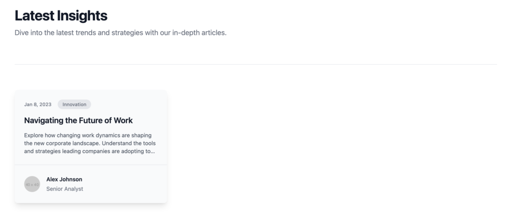
- Highlights: Soft background transitions, minimalistic design, and focused content presentation.
<div class="bg-white py-24 sm:py-32">
  <div class="mx-auto max-w-7xl px-6 lg:px-8">
    <div class="mx-auto max-w-2xl lg:mx-0">
      <h2 class="text-3xl font-bold tracking-tight text-gray-900 sm:text-4xl">Latest Insights</h2>
      <p class="mt-2 text-lg leading-8 text-gray-500">Dive into the latest trends and strategies with our in-depth articles.</p>
    </div>
    <div class="mx-auto mt-10 grid max-w-2xl grid-cols-1 gap-x-8 gap-y-16 border-t border-gray-200 pt-10 sm:mt-16 sm:pt-16 lg:mx-0 lg:max-w-none lg:grid-cols-3">
      <article class="flex flex-col max-w-xl items-start justify-between bg-gray-50 hover:bg-gray-100 transition-colors duration-300 rounded-lg overflow-hidden shadow-lg">
        <div class="p-6">
          <div class="flex items-center gap-x-4 text-xs font-medium text-gray-500">
            <time datetime="2023-01-08">Jan 8, 2023</time>
            <a href="#" class="rounded-full bg-gray-200 px-3 py-1 hover:bg-gray-300 transition-colors duration-300">Innovation</a>
          </div>
          <div class="group relative mt-4">
            <h3 class="text-xl font-semibold leading-6 text-gray-900 group-hover:text-blue-600 transition-colors duration-300">
              <a href="#">
                Navigating the Future of Work
              </a>
            </h3>
            <p class="mt-4 text-sm text-gray-600 line-clamp-3">Explore how changing work dynamics are shaping the new corporate landscape. Understand the tools and strategies leading companies are adopting to thrive in a digital-first world.</p>
          </div>
        </div>
        <div class="p-6 border-t border-gray-200 w-full">
          <div class="flex items-center gap-x-4">
            <img src="https://via.placeholder.com/40" alt="Author Avatar" class="h-10 w-10 rounded-full">
            <div class="text-sm leading-6">
              <p class="font-semibold text-gray-900">
                Alex Johnson
              </p>
              <p class="text-gray-500">Senior Analyst</p>
            </div>
          </div>
        </div>
      </article>
    </div>
  </div>
</div>
Design 2: Image Overlay Card
The “Image Overlay Card” is a visually striking design that leverages beautiful imagery to draw attention. With a dark overlay on hover, the text becomes more readable, and the call to action more pronounced. It’s perfect for featuring high-impact articles where visuals play a key role in storytelling.
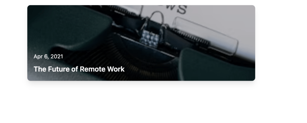
- Highlights: Full-width images, overlay effects for improved readability, and a captivating call to action.
<article class="relative max-w-xl flex flex-col overflow-hidden rounded-lg shadow-lg hover:shadow-xl transition-shadow duration-300">
<img src="https://images.unsplash.com/photo-1586339949916-3e9457bef6d3?ixlib=rb-1.2.1&auto=format&fit=crop&w=256&h=256&q=80" alt="" class="object-cover w-full h-48">
<div class="absolute inset-0 bg-black bg-opacity-25 flex items-end p-4">
<div class="flex flex-col">
<time datetime="2021-04-06" class="text-sm text-white">Apr 6, 2021</time>
<h3 class="mt-2 text-lg font-semibold text-white">
<a href="#" class="hover:underline">The Future of Remote Work</a>
</h3>
</div>
</div>
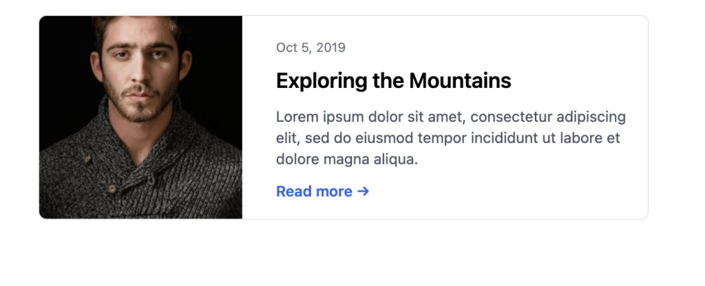
</article>Design 3: Card with Horizontal Image
Our third design, featuring a “Card with Horizontal Image,” adopts a more traditional layout with a twist. The horizontal image adds depth, while the text layout encourages readability. This design is versatile, fitting well within both professional and creative blog environments.
- Highlights: Balanced image-to-text ratio, clean typography, and an inviting “Read more” link.
<article class="max-w-xl flex gap-4 border rounded-lg overflow-hidden">
  <img src="https://images.unsplash.com/photo-1506794778202-cad84cf45f1d?ixlib=rb-1.2.1&auto=format&fit=crop&w=256&h=256&q=80" alt="" class="w-1/3 object-cover">
  <div class="flex flex-col justify-between p-4">
    <div>
      <time datetime="2019-10-05" class="text-xs text-gray-500">Oct 5, 2019</time>
      <h3 class="mt-2 text-xl font-semibold leading-tight">Exploring the Mountains</h3>
      <p class="hidden md:block mt-3 text-sm text-gray-600">Lorem ipsum dolor sit amet, consectetur adipiscing elit, sed do eiusmod tempor incididunt ut labore et dolore magna aliqua.</p>
    </div>
    <a href="#" class="text-blue-600 hover:text-blue-800 text-sm font-semibold">Read more →</a>
  </div>
</article>
Design 4: Full-Width Card with Category Badge
Lastly, the “Full-Width Card with Category Badge” is a testament to the power of color and categorization. The full-width image serves as a captivating backdrop for the article title, while the category badge in vibrant hues instantly informs readers of the content genre.
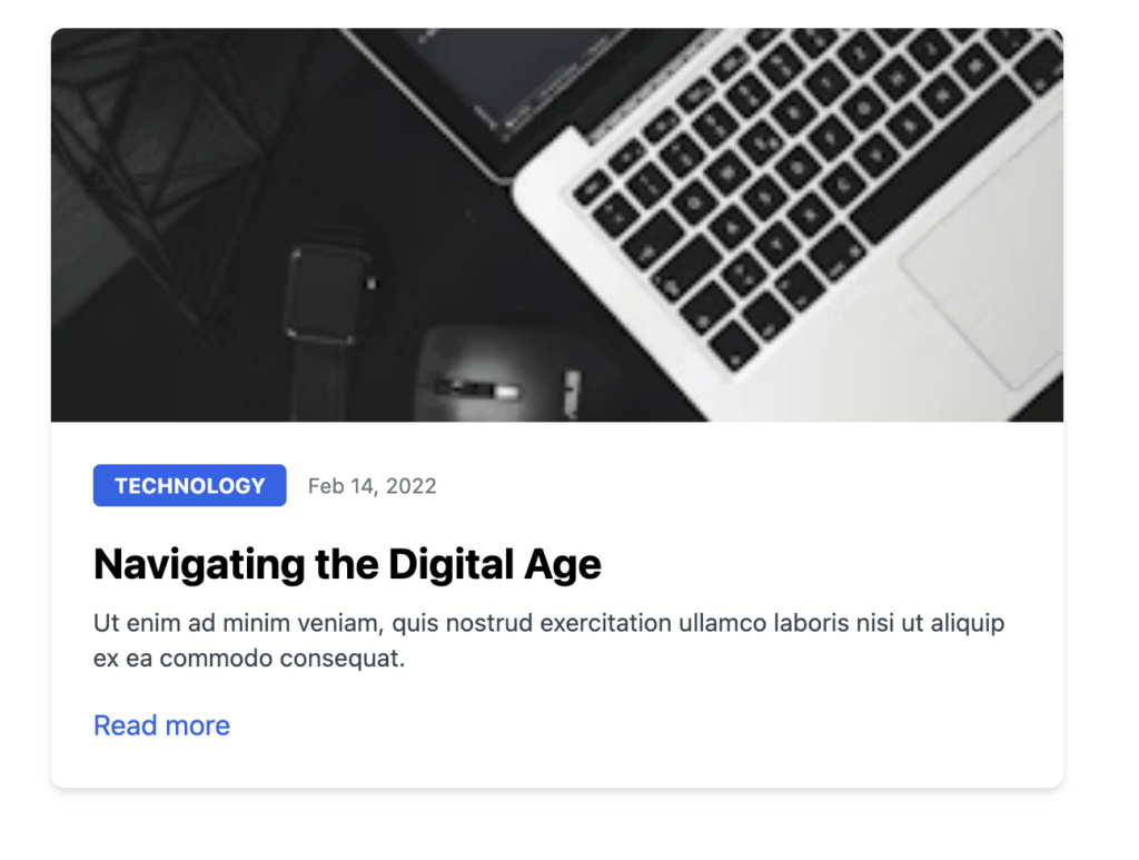
- Highlights: Bold use of imagery, color-coded categories for quick identification, and seamless integration into various blog themes.
<article class="max-w-xl mx-auto bg-white rounded-lg shadow-md overflow-hidden">
  <img class="w-full h-56 object-cover object-center" src="https://images.unsplash.com/photo-1522252234503-e356532cafd5?ixlib=rb-1.2.1&auto=format&fit=crop&w=256&h=256&q=80" alt="Article">
  <div class="p-6">
    <div class="flex items-center">
      <a href="#" class="px-3 py-1 bg-blue-600 text-white text-xs font-bold uppercase rounded hover:bg-blue-500">Technology</a>
      <time datetime="2022-02-14" class="ml-3 text-xs text-gray-500">Feb 14, 2022</time>
    </div>
    <h2 class="mt-4 mb-2 text-2xl font-bold hover:text-blue-600">
      <a href="#">Navigating the Digital Age</a>
    </h2>
    <p class="text-sm text-gray-700">Ut enim ad minim veniam, quis nostrud exercitation ullamco laboris nisi ut aliquip ex ea commodo consequat.</p>
    <div class="mt-4">
      <a href="#" class="text-blue-600 hover:underline">Read more</a>
    </div>
  </div>
</article>
Leave a Reply